Your charting platform is better than this one. It cannot draw any of this.
This is not a charting package and it will not replace one. It exists because the score, the levels the desks published and the history of releases against consensus have to be drawn somewhere, and they only exist here. A chart is where a relationship becomes visible rather than remembered.
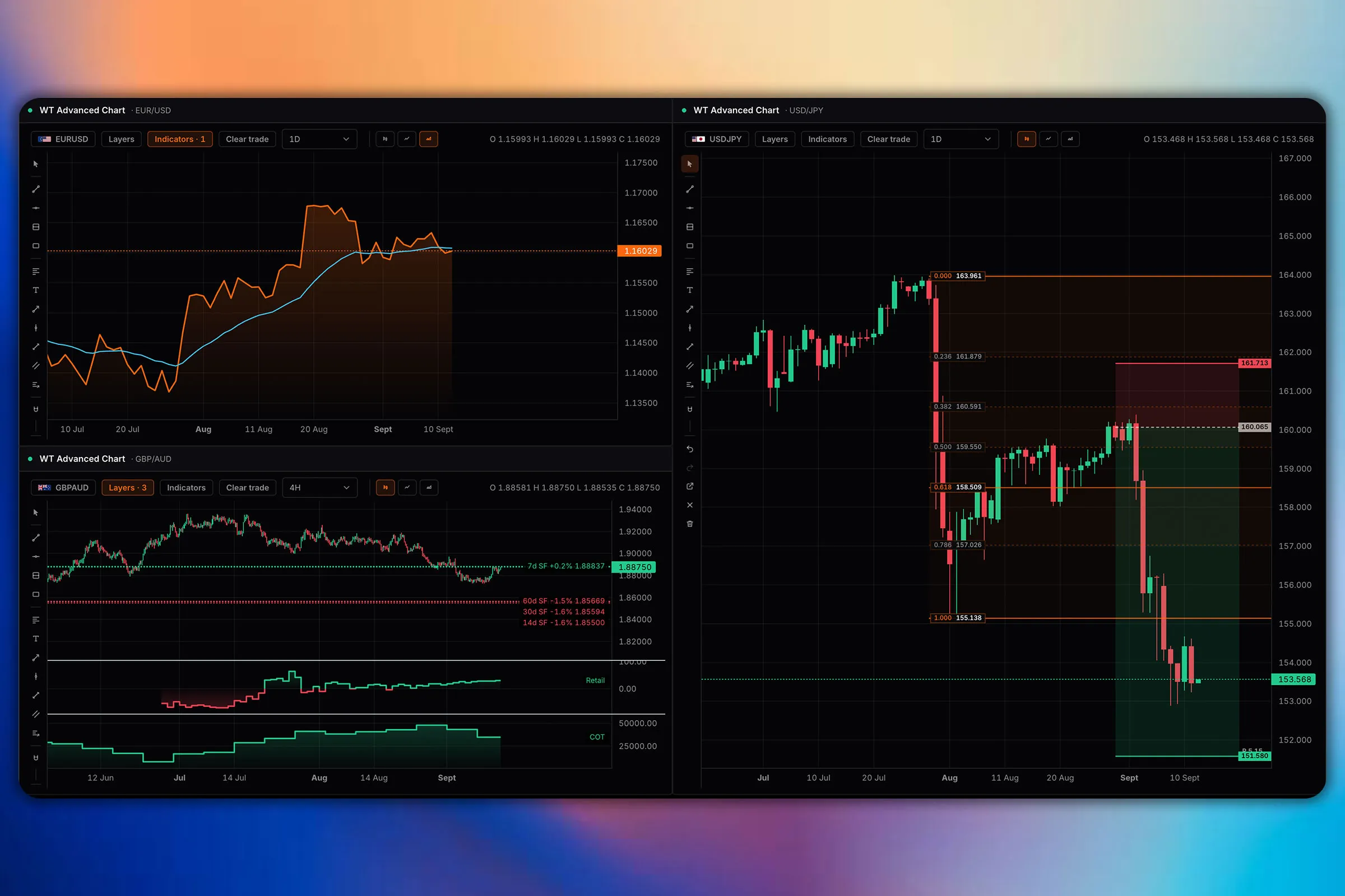
Four overlays
Things that exist nowhere else, so they can be drawn nowhere else.
- The composite score
- The engine reading for that market, on the same time axis as the price, so a score that turned three weeks before the move is visible as a fact rather than remembered as an impression.
- Published bank levels
- Where the desks put their entries and targets, drawn where they sit. A level six banks published within a day of each other is a different object from one analyst line.
- Release history
- Where each economic release landed against consensus, marked on the series, so the question "did this pair actually move on that print" has an answer you can see.
- Positioning extremes
- Where speculative positioning reached the edge of its own range, which is rarely where price turned but is usually near it.
Depth
Where each one wins, honestly.
Being straight about it
Keep using the chart you already use.
If charting is the centre of your process, nothing here should change that. There are fewer drawing tools, fewer indicators, fewer instruments, no scripting and no chart alerts, and a reader who charts seriously will notice all of that inside ten seconds.
What this chart is for is the question that needs two things on one picture: did the score turn before the move, did the pair react to the last three prints, where exactly did six desks put their level. Answering those in the same window as the rest of the work is the whole of the claim, and it is a small one.
Charting, answered.
Is this a replacement for a dedicated charting platform?
No. A dedicated charting package has more drawing tools, more indicators, more timeframes, more instruments, scripting and alerting, and its chart is better than this one. If charting is the centre of your process, keep using it. This chart exists so the terminal own data has somewhere to be drawn.
What can be drawn here that cannot be drawn there?
The composite score on the same time axis as the price, the levels the research desks actually published, the history of economic releases against consensus, and where positioning reached an extreme. None of that is available anywhere else, because none of it exists anywhere else.
Why does that matter?
Because the useful question is usually about the relationship rather than the price. Did the score turn before the move or after it. Did the pair react to the last three prints or ignore them. Six desks published a level within a day: where was it. Those are answered by looking, and only if the two things are on the same picture.
How many markets can it chart?
The 24 markets the terminal scores: currencies and crosses, metals and energy, and the equity indices.
Can I put a chart on my own board?
Yes. It is a panel like any other, so it sits beside the research, the calendar or the positioning rather than in a separate window, and its settings save with the board.
Is it free?
The chart is on the free plan, along with 32 of the 103 panels overall.